
Services
General Adjustment ($30)
Tune & Smooth and any other adjustment to make your nib feel and flow the way you want.

Size Reduction ($50 / +$10 Add-on)
Size Reduction ($50 modification) involves grinding down the contact patch by one standard size. (Exp. Broad down to Medium.) Some paper, ink, and nib combinations may not produce your desired line width. For this, Nib Tailor might recommend a different customization.
Size Reduction Add-on (+$10 Add-on) when reduction is combined with another nib modification. (Exp. Broad point customized to Medium Architect RT is $70 + $10.) This also applies to more intensive size reductions that wears down tooling faster. (Exp. Broad down to Extra Fine is $50 + $10).
As manufacturers can exhibit a wide margin of variance even within their own brands, it is suggested that you include a physical writing sample or specify in metric widths. For the discerning fountain pen user, please include a writing sample of from your favorite nib on your preferred paper to demonstrate the desired outcome (if possible). “The quick brown fox jumps over the lazy dog“ is a common pangram. As is, ""Sphinx of black quartz, judge my vow." I am also satisfied with writing “jump quickly” or “coffee jogger.”
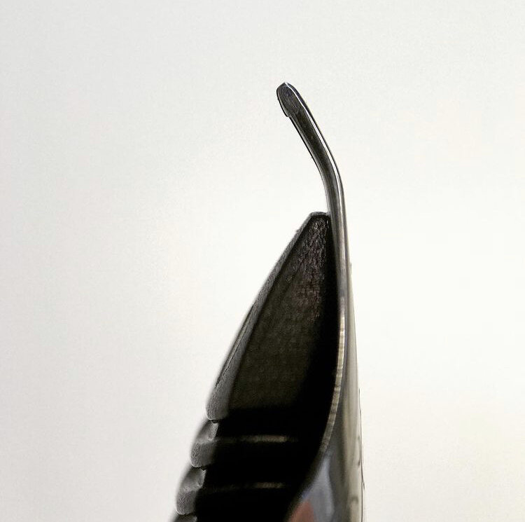
Bent Tines Repair ($35 to $110)
Unplated gold nib repairs tend to have better looking results than other common nib metals. If you have a metal other than gold, feel free to inquire (but please recalibrate cosmetic expectations).
Depending on severity, not all damage can be rectified but I treat every repair with respect and patience. (The challenge is a bit like putting a kinked metal coat hanger back to it’s original shape… if you’ve ever attempted this, you understand the basic idea.)
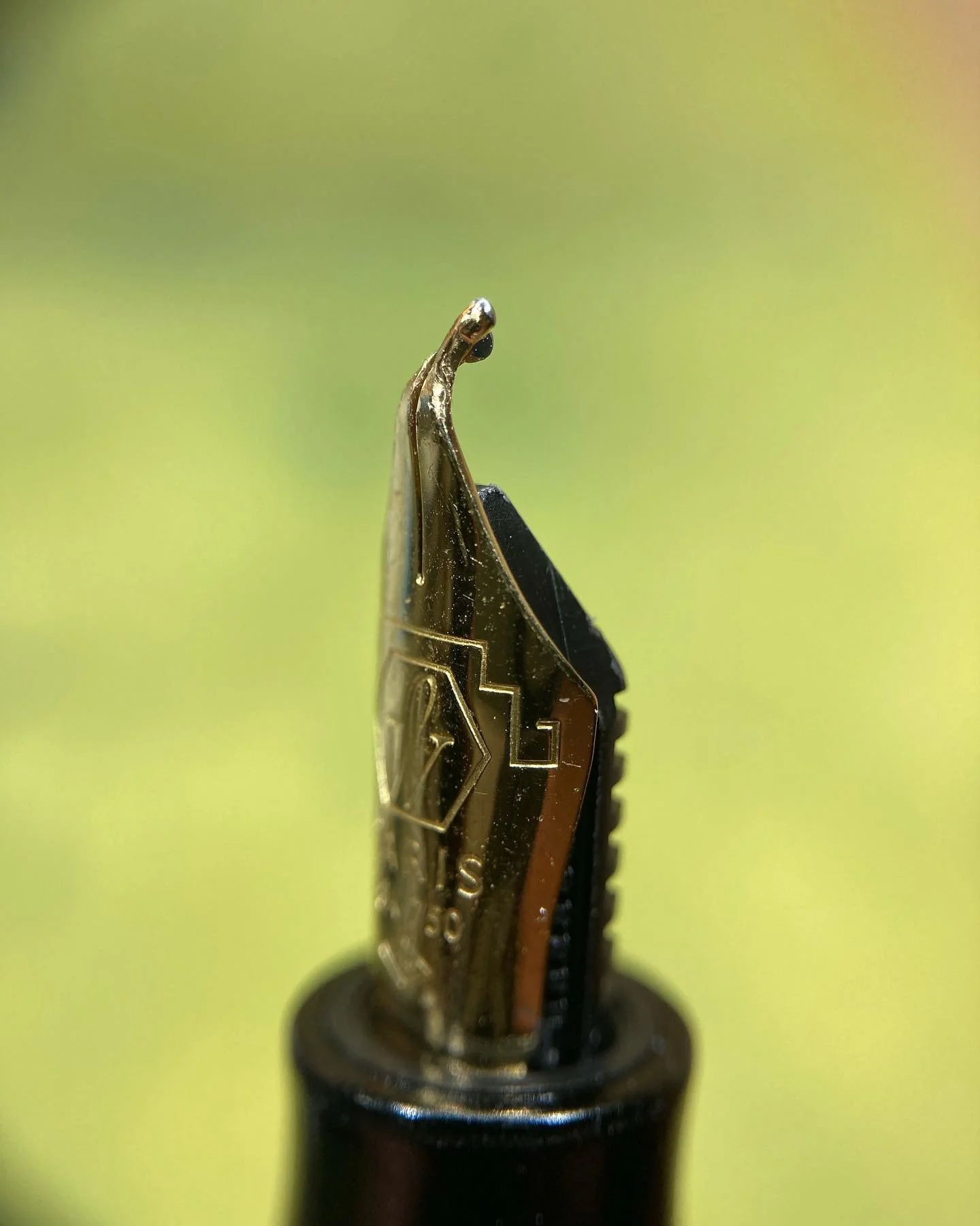
Needlepoints ($60)
Needlepoint is one of my all time favorite grinds and was my primary focus when I began to study the works of a generous nibmeister. These take a long time to make but are an infatuation and I relish bringing a good needlepoint to life. My needlepoint is a Japanese EF of O.25 mm depending on the pen-paper-ink combination used (though drier combinations yield an even finer line). This ends up being a great daily writer for those with tiny handwriting or demand detailed lines.*
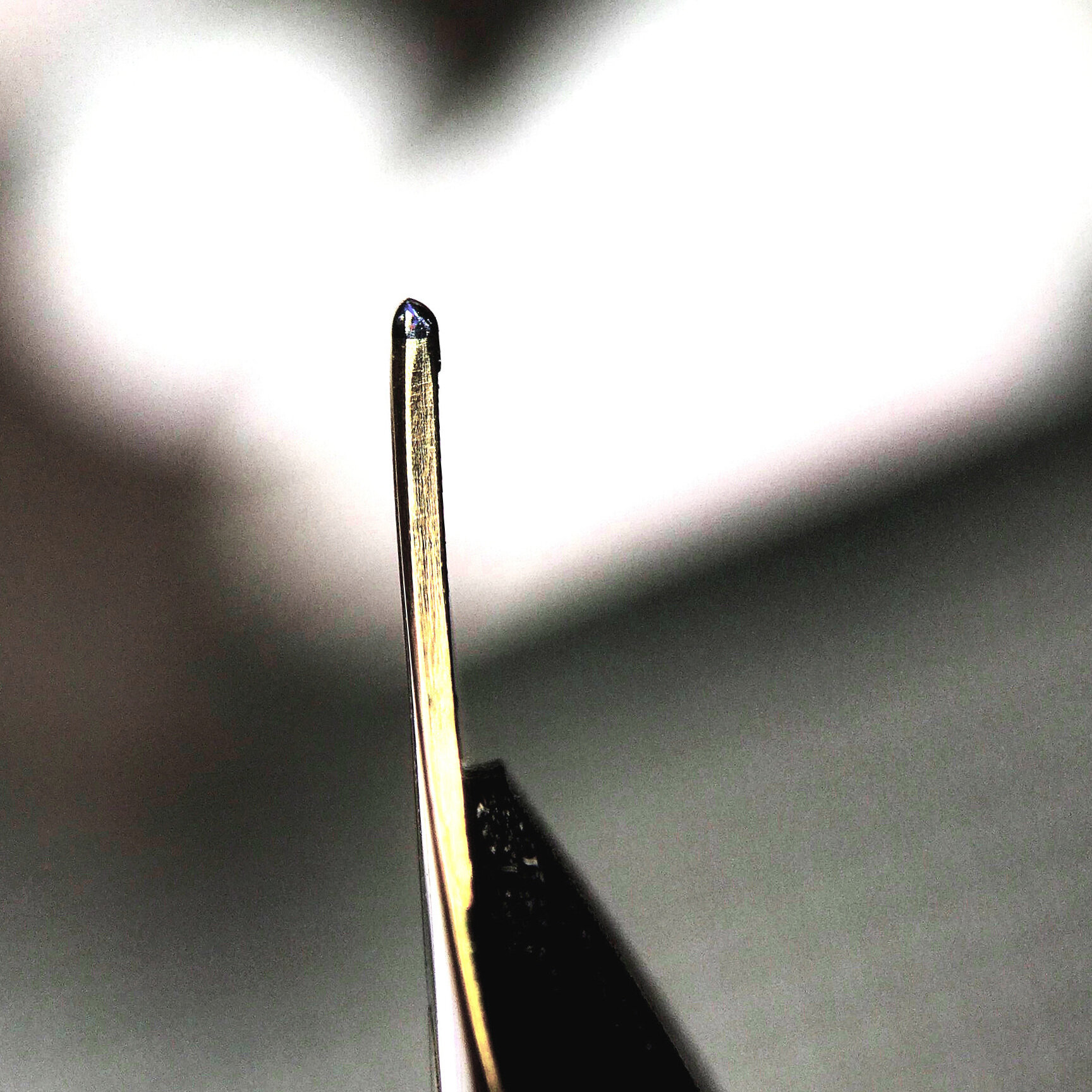
0.19 Needlepoint is an XXF 0.19mm line writer. This signature variation on the needlepoint grind is recommended for advanced fountain pen users who demand the absolute finest lines without veering into Saibi-togi territory. It is a comparatively drier version with more of a pencil-like feel than my usual needlepoint. Each unit is tested on Rhodia paper with Waterman’s ink with a light hand. As always, your results may vary when using other ink-paper-fill combinations.
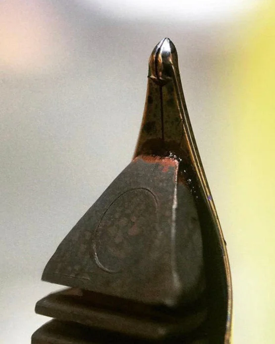
Formal Seam Ripper This ultra fine shape is a specialists tool intended only for those with the lightest writing pressure on luxurious smooth paper. The shape creates wispy thin lines, finer than a needlepoint. It is often what people imagine a needlepoint to be, but the needlepoint is much more user friendly in comparison. Alternatively, you might consider the Inverted Gochu, which provides a bolder second option on the reverse side.
*Another option to consider is the Pindot modification for a finer and drier line that works well with a wider range of paper types. Read more in the Brush Bends section below.

Selvedge ($60)
Selvedge are intended for individuals who want the smoothness of a stub at an even more forgiving variable writing angle. The stub-like line variation is consistent regardless of how you hold your pen so there is not a break point where the pen pivots off the contact patch if you have a very expressive writing style. This is also good for people that change their grip throughout the day or vary by task (such as the steep angle caused by taking quick notes while standing against a desk).
Selvedge Italic produces line variation closer to a Cursive Italic but with the smoothness and angle freedom of the Selvedge. Generally, the Selvedge iteration of an italic has slightly less variation than a Cursive italic.

Architects ($70 to $85)
Architect RT This “Reversible Tip” architect grind variant has been my daily writer lately for it’s ability to produce three distinctly different line weights from one single nib. When I want dramatic line variation, the traditional orientation provides narrow down and wide cross strokes. The reverse side is an extra fine point (but can be tuned up to a medium in some cases). At the same price as a traditional “flat top” architect, I consider the RT iteration to be a much better value due to this added functionality.
As with any architect, a broader original tipping results in more line variation. Line variation for finer tips can be made but there tends to be more feedback and a stricter adherence to the writing angle, side pitch, and nib rotation. Please specify your desired tip size when placing an order request.
Inverted Architect This reversed architect writes as a fine with an architect/Arabic/Hebrew on the other side. Due to a wide variance in nib manufacturer tipping, the resulting architect on the top side can sometimes be drastically different between units. I always strive to maximise line variance, but please specify in the order comments if you have exact metric measurements and I will match as best possible with the material provided
Forgiving Architect A ramped version that trades maximum line variation for a more forgiving writing experience.
Candy ($85) Shares it’s DNA with The Tailor 3776 modified pens that I have been too busy to restock. The Candy is an architect in normal orientation with a cursive italic on the reverse. Please note that this customization is $85 due to the highly unforgiving tolerances, extra tool wear, and time involved. This modification usually requires the largest nib points manufactured (exp. BB / Coarse / VP Stub).
Dandy ($85) Dandy is the sibling of Candy. It is a cursive italic in normal orientation with an architect on the reverse. Please note that this customization is $85 due to the highly unforgiving tolerances, extra tool wear, and time involved. This modification also requires the largest nib points manufactured (exp. BB / Coarse / VP Stub).
Tapered Ridge Grinds ($70)
Gochu 고추 (GO-chu) is a tapered chili pepper shape used to mimic specific brush strokes in some East Asian calligraphy traditions. This grind provides thin vertical and thick horizontal lines that change width based on your writing angle. The reverse side writes as an ultra fine point. Gochu can be viewed as the harmony state between a pointed round artist’s paintbrush and an architect fountain pen nib. This style is good for those who like the performance of a Naginata-togi style nib or for those who desire a more “user friendly” architect nib. The reverse point provides a toothy ultra fine line.
Inverted Gochu is the reverse form of the Gochu nib. It places a crisp ultra fine point in normal orientation and the pepper shape on top. This is a nice way to add an expressive second option to your daily writer or illustration pen. This style is good for those who like the performance of a Saibi-togi nib but also want a Naginata-togi to alternate with.
Seamstress is a gentler form of the Inverted Gochu. The primary position is a fine point while the reverse is a curved ridge. This yields a better daily writing experience for a wider range of users who like fine… but not the “let’s be extra cautious” fine.
Brush Bends ($70)
Wing nib utilizes the bottom of the tines for dramatic calligraphy swaths of ink as well as the point for finer details. This modification can be thought of as something between a round and a filbert paintbrush on the flat. It is good for those who like the performance of a Fude de Mannen style nib. The Wing nib modification gets it’s name from the fabric triangles that jut out from the neck band of a formal wing collar dress shirt.
Bu-di 부리 (BU-dee) is a more pronounced downward bird’s beak shape. It is wetter than the Pindot nib with more emphasis on use as a “reverse Fude” rather than office paper compatibility. It is also more user friendly for fountain pens with tight cap clearances on Fude style nibs. This modification is good for those who like the performance of a Naginata Concord style nib.
Pindot curves slightly downward for a line effect that can be favorable with paper prone to ink bleeding or when detail is required. The modification causes you to write on a pinched point. This customization is good for those who like the performance of a Posting (PO) style nib or for some left hand writers who desire a drier line to reduce smudging. The Pindot is named for the pattern on the offical U.S. Postal Service Carrier Necktie.
Oxford is a small upward bend that causes you to write on the bottom of the point. This ramping provides a wetter and smooth writing experience that can be helpful to those with high writing angles and can be combined with some of the other nib grinds, such as the Gochu (which then becomes the Gochu Oxford). The Oxford nib modification can have a point silhouette that reminds me of soft button down collar Oxford cloth shirts, hence the name. Those who like Waverly style nibs are likely to enjoy this customization.

Classic Western Grinds ($50)
[Too many options? My top requests for points with thick down strokes and thin cross strokes are the Cursive Italic for expressive flair and Selvedge for ease of use. The rest are listed below for highly inquisitive individuals.]
Cursive Italic is one of the most popular grinds as it’s more user friendly than a Formal Italic yet provides more line variation than a Formal Stub. This has a noticeably thinner rectangular contact patch than the Stub.
Formal Italic is the maximum line variation available as it has a very sharp and narrow contact patch that requires a light hand. Generally only recommended for calligraphy professionals and enthusiasts.
Formal Stub has a larger flat rectangular contact patch with the page. It adds flair with it’s modest line variation between broader vertical and thinner horizontal strokes.
Club Collar Stub has a larger pillow contact patch with the page. It is the most forgiving of the traditional grinds and offers similar line variation as the Formal Stub.
Round Nose Cursive Italic is an overly smoothed version of the Cursive Italic and requires a wider Medium or Broad tip to grind. It has less line variation but is very forgiving as all edges have been rounded off.

Oblique ($50)
An oblique is gently slanted to compensate for grip rotation or side tilt of a a classic Western grind. My default oblique is a stub unless you specify otherwise.
Left Foot Oblique alleviates a left tine digging into the paper when rotated counter-clockwise. (For example, when a right hand underwriter rolls the thumb down or middle finger outwards.)
Right Foot Oblique alleviates a right tine digging into the paper when rotated clockwise while gripped.
Soft Modifications ($70)
This modification is only available to 14k gold nibs. Other gold alloys are too soft with modern fabrication techniques. Both versions are recommended only for experienced flex nib users — dip pens with consumable Zebra G Comic nibs are an economical way to practice your form before moving on to flex-modified gold fountain pens.
The success of your flexed writing is greatly improved with inks of proper viscosity. A quick test is to shake your ink bottle. If bubbles form, you can be more confident the ink is adequate for flex fonts.
Also of note is the process of thinning tines makes them more susceptible to being sprung. You will be able to enjoy many more years of use if you do not splay the tines more than 1.5 mm (less than 1/16 inch). Holding your pen at a lower writing angle will also prolong the life of any flex nib regardless if it is a modern thin-down or vintage hammer-forge.
Super140s Soft modification makes your gold nib bounce and is a great option if you dislike stiff “hard” nibs. Gentle pressure creates line variation. Depending on construction, this customization will reshape the nib shoulders more abruptly.