


A signature tool from the mind of JC Ament. This grind requires the massive amount of tipping provided by the 14k gold Coarse nib of the Platinum 3776 to sculpt. As such, it is a very labor intensive and risky process. At this time, the Tailor grind is exclusively sold as a complete package of pen and grind as I take the risk up front and never with your pens.
If you prefer to use pens other than the 3776, I also offer the Flexible Nib Factory adapter housings for JoWo #6 and Bock 250 chamber-filled pens. (Such as eye-dropper pens. Not compatible with cartridge/converter.) Or if you are truly an experimental spirit… a more advanced hobbyist technique is to place the Platinum nib in a Jowo #6 feed & housing… but this off-label usage is for the inky-finger crowd and not recommended for most users.)
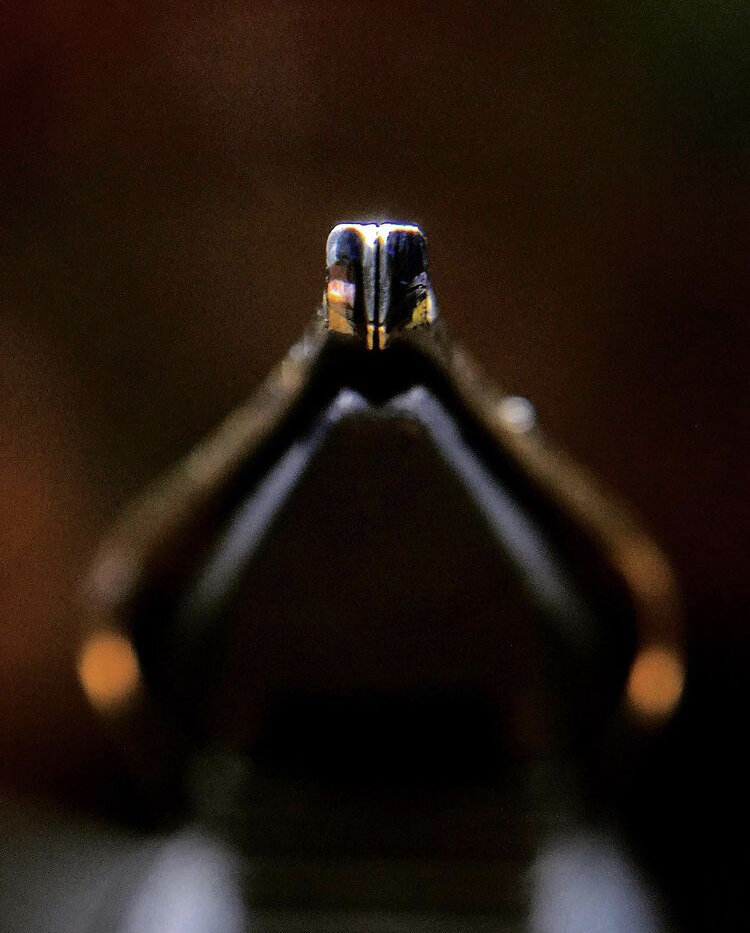
This exclusive T-shaped tip writes as an architect in the normal orientation. On the reverse side, with a low writing angle, writes as a Cursive Italic. On the reverse side, with a high writing angle, writes as a Fine.
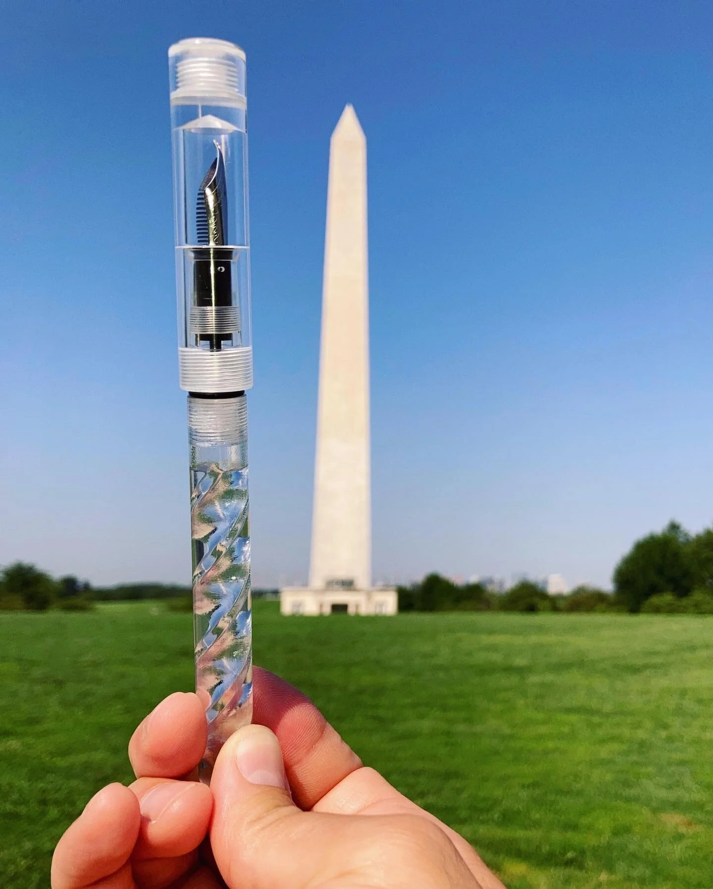
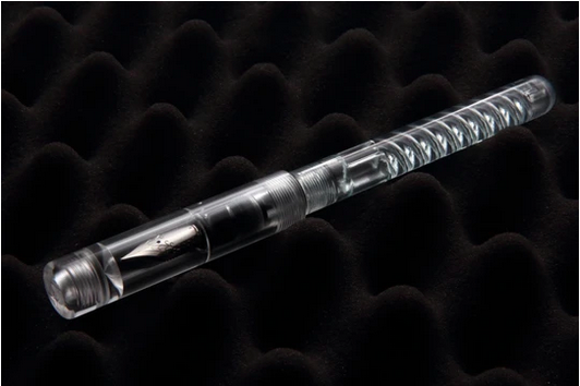
Caps and grip sections machined from solid rods of clear cast acrylic. Completely 3D printed barrel of photo-reactive resin. Paired with a JoWo #6 Nib Unit, the ACP6 offers an unparalleled eyedropper writing experience.
Since this pen uses JoWo #6 nib unit, it can be paired with any Pret a Porter nib unit without waiting in line for a Tailored Fitting custom grind.
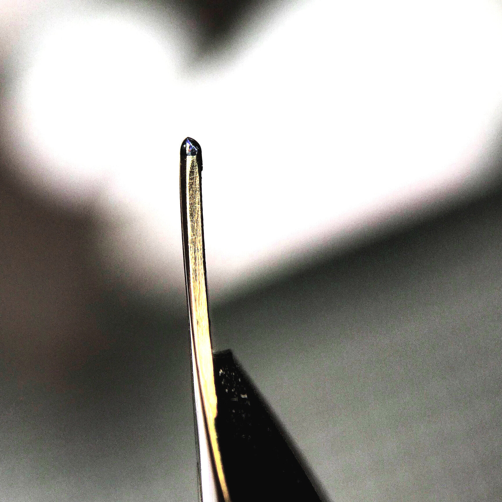
XXXF 0.19mm line writer. This signature variation on the needlepoint grind is recommended for advanced fountain pen users who demand the absolute finest lines without veering into Saibi-togi territory. It is a drier version with more of a pencil-like feel than my usual needlepoint. Each unit is tested on Rhodia paper with Waterman’s ink with a light hand. As always, your results may vary when using other ink-paper-fill combinations.
These are intended for individuals who want the smoothness of a stub at an even more forgiving variable writing angle. The stub-like line variation is consistent regardless of how you hold your pen so there is not a break point where the pen pivots off the contact patch if you have a very expressive writing style. This is also good for people that change their grip throughout the day or by task.
Similarly, the radial contact patch can be made on an italic for something closer to a Cursive Italic line variation but with the smoothness and angle freedom of the Selvedge. Generally, the Selvedge iteration of an italic has slightly less variation than a Cursive italic.
Please specify desired tipping width when placing an order request.
This “Reversible Tip” architect grind variant has been my daily writer lately for it’s availability to produce two distinctly different line types from one single nib. When I need a distinct line variation, the traditional orientation provides thin vertical and wide side strokes. But sometimes I need a finer point for detailed notes or am in too much of a rush to deal with the idiosyncrasies of an architect grind. The Arch RT allows me to flip the nib over where the tipping has been left intact and tuned to a traditional fine line (some ink-paper combinations even yield an extra fine line in reverse). At the same price as a traditional architect, I consider the RT iteration to be a much better value due to this added functionality.
As with any architect, a broader original tipping results in more line variation. Line variation for finer tips can be made but there tends to be more feedback and a stricter adherence to the writing angle, side pitch, and nib rotation. Please specify your desired tip size when placing an order request.
The architect grind is idiosyncratic but sublime to me. Some people just can’t seem to get on with them while others use them regularly. I tend to be a daily architect kind of guy. The thin vertical and wide side strokes add a distinct flair that quickly separates my written notes from coworkers.
I generally suggest ordering the broadest architect you can write with as these yield more line variation than the finer end. Finer (or even EF) tips can be made but there tends to be more feedback and a stricter adherence to the writing angle, side pitch, and nib rotation. Please specify your desired tip size when placing an order request.
This reversed architect writes as a fine with an architect/Arabic/Hebrew on the other side. Due to a wide variance in nib manufacturer tipping, the resulting architect on the top side can sometimes be drastically different between units. I always strive to maximise line variance, but please specify in the order comments if you have exact metric measurements. I will find the closest match on hand.
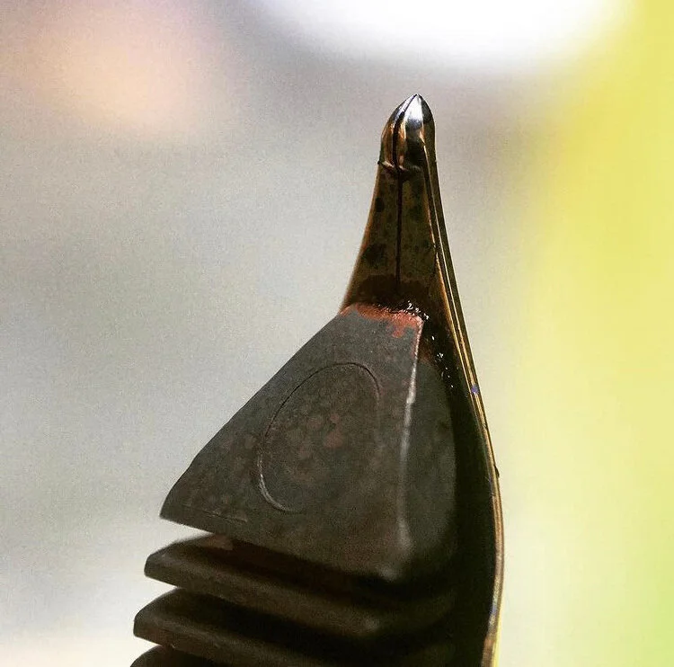
A blade shape created to mimic specific brush strokes in Japanese calligraphy. This can be viewed as the harmony point between an architect and a zoom nib. With a light hand, it yields thin vertical strokes and broader horizontals. Line width changes depending on the angle you hold the pen to the page.
Much like the Inverted Architect, this grind can also be done on the reverse side so your standard writing is fine but the Naginata-togi is on the top. A nice way to add an expressive second option to your daily writer.
This is one of my all time favorite grinds and was my primary focus when I began to study the works of a generous nibmeister. These take a long time to make but are an infatuation and I relish bringing a good needlepoint to life. My needlepoint is a Japanese EF of O.25 mm depending on the pen-paper-ink combination used (though drier combinations yield an even finer line). This ends up being a great daily writer for those with tiny handwriting or demand detailed lines. Upon special request, this can be tuned to a thinner 0.20 mm that has more feedback but is not actually scratchy (does not have a tendency to get clogged with paper fibers). The 0.20 mm version is more of a specialty item and might not be suitable for everyone.
These are the classic grinds that are sometimes offered by the larger pen manufacturers and are most common for Western handwriting. If you have a stock nib on your pen, these can add a nice touch to your writing.
Stub has a larger rectangular contact patch with the page. It is the most forgiving of the traditional grinds and adds flair with it’s modest line variation between broader vertical and thinner horizontal strokes.
Cursive Italic is one of the most popular grinds as it’s more user friendly than a Formal Italic and provides more line variation than a Stub. This has a noticeably thinner rectangular contact patch than the Stub.
Formal Italic is the maximum line variation available as it has a very sharp and narrow contact patch that requires a light hand. Generally only recommended for calligraphy professionals and enthusiasts.
This is an overly smoothed version of the Cursive Italic and requires a thicker Medium or Broad tip to grind. It has less line variation but is very forgiving as all edges have been rounded off. You may be familiar with this writing experience if using a “Cursive Calligraphy” style nib; except those often have much wider tips, such as 1.5mm.
An oblique is gently slanted to compensate for grip rotation of a Stub, Cursive Italic, or Formal Italic.
Left Foot Oblique alleviates a left tine digging into the paper when rotated counter-clockwise. (For example, when a right hand underwriter rolls the thumb down or middle finger outwards.)
Right Foot Oblique alleviates a right tine digging into the paper when rotated clockwise while gripped.